Often times we need to create a form where instead of displaying each field one below another, we need to display fields side by side or in a multi-column layout. Gravity Forms by default has a single column layout but it does have excellent documentation on how to create a multi-column layout. If you only need to display 2-3 fields in a multi-column layout, you can achieve that easily by using the CSS-ready classes provided by Gravity Forms here.
In this tutorial, I am going to show how to use CSS grid to format the fields in a complex layout. Before you start creating your layout using this method, please check if you need to support any of the older browsers which don’t really support CSS grid. You can check them here.
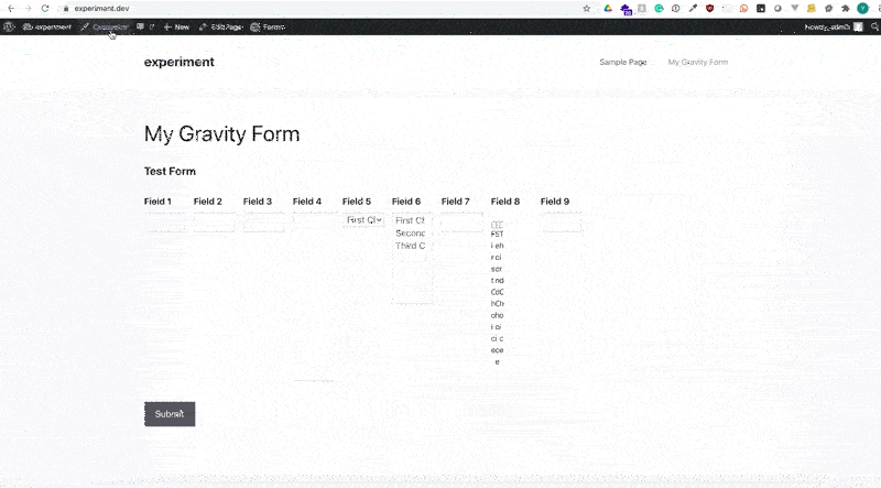
Here’s how my test form currently looks like. I am using GeneratePress theme from the WordPress repo and the Gravity Forms plugin and nothing else. As you can see, I have quite a few different kinds of fields. All displayed in a single column layout that Gravity Form ships with.

Step 1
Make the field size “Large” by editing your form field. The setting to do that is under Appearance tab once you click on the field in the edit form screen.

Step 2
Add a CSS class to your form so that when we write our CSS code (nothing too complex). You can do that by going to edit form screen, click on Settings -> Form Settings. Scroll to Form Layout section and you should see an input field “CSS Class Name”. I entered “my_custom_form” but you can use anything you like. Just remember what you enter here because we will be using this class to target our form in later steps.

Step 3
This field is optional if you know your way around how to lookup field IDs that we need to target. Gravity Form by default has a unique CSS ID for each field.
However, to make it easier for us, we’re going to add a CSS class to each of our fields. I am going to use “my_field_1”, “my_field_2” etc for each of the fields in my form but you can use whatever you prefer.
Way to do that is in the same “Appearance” tab that we went to in Step 1. You will see a Custom CSS Class field where you can enter your preferred value.
Make sure you click on “Update” once you’re done adding similar CSS classes to each field.

Step 4
Time to write some CSS code. My recommended way is to create a child theme and write my CSS there but if you do not have a child theme installed or not know how to do that, it’s absolutely fine to add your custom CSS to “Additional CSS” section under Customize. Like we’re going to do here.
Just remember that the CSS code you save here will be tied to the theme you’re using currently so if you ever change your website theme in future, you will have to copy this code and paste it under the same place once you’ve your new theme installed.
First, we will target our entire form and change it to display all fields in a 12 column grid. This will change the display of the fields and put all of them side by side in 12 columns.
Here’s the code to put in Customize -> Additional CSS section
form.my_custom_form .gform_body ul{
	display:grid;
	grid-template-columns:repeat(12,1fr);
}
Step 5
If you take a look at your form now, it will look like a jumbled mess. That’s because with our above CSS code we asked the form container to be a 12 column container. The grid-template-columns line above tells the ul div to divide the available space into 12 equal columns.
The browser then automatically put one child element in one column. By default each gravity form field is in an <li> element which are all children of the <ul> element that we’re targeting with our CSS.
CSS grid also provides a way where we can specify how much width should a particular child element will take which is what we’re going to use for our layout.
Assume that my field 1 needs to be 4 columns wide, field 2 needs to be 6 columns wide and field 3 needs to be 2 columns wide. Here’s what we need to write in our CSS to achieve that. Watch how my layout shifts as I write my CSS.
form.my_custom_form li.my_field_1{
	grid-column:1/5;
}
form.my_custom_form li.my_field_2{
	grid-column:5/11;
}
form.my_custom_form li.my_field_3{
	grid-column:11/13;
}
The code above is what we used to align the first three fields. If you notice, the field 3 CSS has the grid-column value that goes up to 13 but we specified 12 columns, why’s that? That’s because of how CSS grid implementation works in a browser. Imagine a 12 column table, to create that table we will have to draw 13 vertical lines. That’s exactly what we’re telling the browser here.
By specifying a grid-column value of 1/5 for my_field_1, we’re telling a browser to start field 1 at the first vertical line and stop at the 5th vertical line. Similarly, field 3 will start at the 11th vertical line and stop at the 13th vertical line which is the rightmost edge of the container. You can read more about it here.
I am going to add few more lines of code to format the other fields in various sizes.
form.my_custom_form .gform_body ul{
display:grid;
grid-template-columns:repeat(12,1fr);
}
form.my_custom_form li.my_field_1{
grid-column:1/5;
}
form.my_custom_form li.my_field_2{
grid-column:5/11;
}
form.my_custom_form li.my_field_3{
grid-column:11/13;
}
form.my_custom_form li.my_field_4{
grid-column:1/7;
}
form.my_custom_form li.my_field_5{
grid-column:7/13;
}
form.my_custom_form li.my_field_6{
grid-column:1/4;
}
form.my_custom_form li.my_field_7{
grid-column:4/7;
}
form.my_custom_form li.my_field_8{
grid-column:7/10;
}
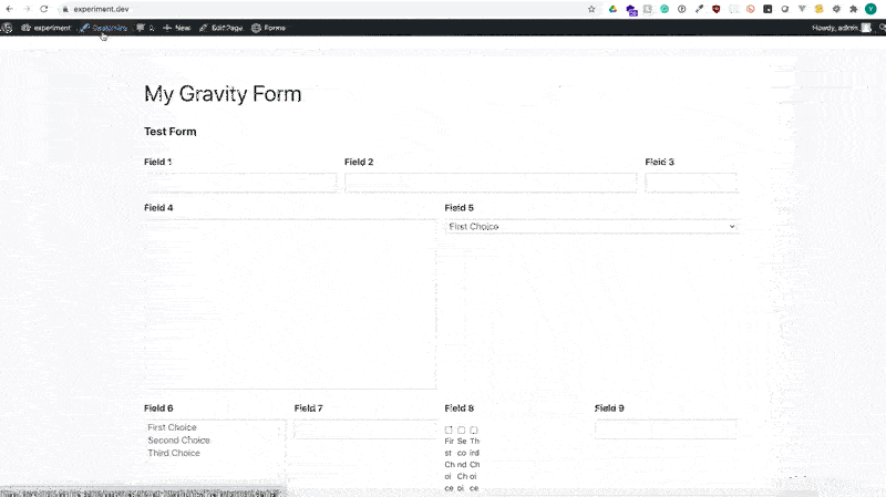
form.my_custom_form li.my_field_9{
grid-column:10/13;
}With the above code in place, my form looks like this now. Notice how my field 8 looks. That’s because the checkbox field in Gravity Form uses <ul> element to display the checkboxes. It’s inheriting the 12 column grid that we defined for the parent element. Easy to go back and make the change to parent <ul> code to make this go away but let’s try a different way.
Formatting checkboxes to align the checkbox and label it in front of it is often an annoyance. Vertically centering checkbox and the label is oftentimes tedious work. Using the CSS grid on the checkbox field will allow us to solve both of these issues. Here’s how.
form.my_custom_form li.my_field_8 ul{
    display:grid;
    grid-template-columns:auto;
}
form.my_custom_form li.my_field_8 ul li{
    display:grid;
    grid-template-columns:auto 1fr;
    align-items:center;
    grid-gap:5px;
}
.my_custom_form_wrapper form.my_custom_form .gform_body li.my_field_8 ul.gfield_checkbox li input[type=checkbox] {
    margin-top: 0;
}
I had to cheat a little to display the checkbox and label vertically aligned as you can see from the last three lines of my code above. Gravity Form adds a 6px margin-top property in Chrome so I had to make it zero by overriding it.
Everything else was done using CSS Grid as I promised. The <ul> inside li.my_field_8 which is the checkbox container was again set to display grid but this time only with one column. The individual checkbox items were again set to display in a grid. This time with 2 columns, 1 column takes on auto width and the other column occupies the remaining space. The grid-gap specifies the distance between two columns which in our case are the checkbox and the label. The align-items tell the browser to vertical center the checkbox and the label.
Hope this helps you get started on using CSS Grid to display Gravity Form in a multi-column layout. Please let me know if I missed anything.